MWA Rebranding Project
Re-branding project for the Metropolitan Waterfront Alliance with multiple print/ digital applications
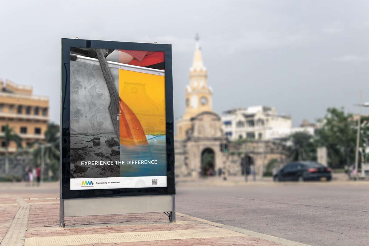
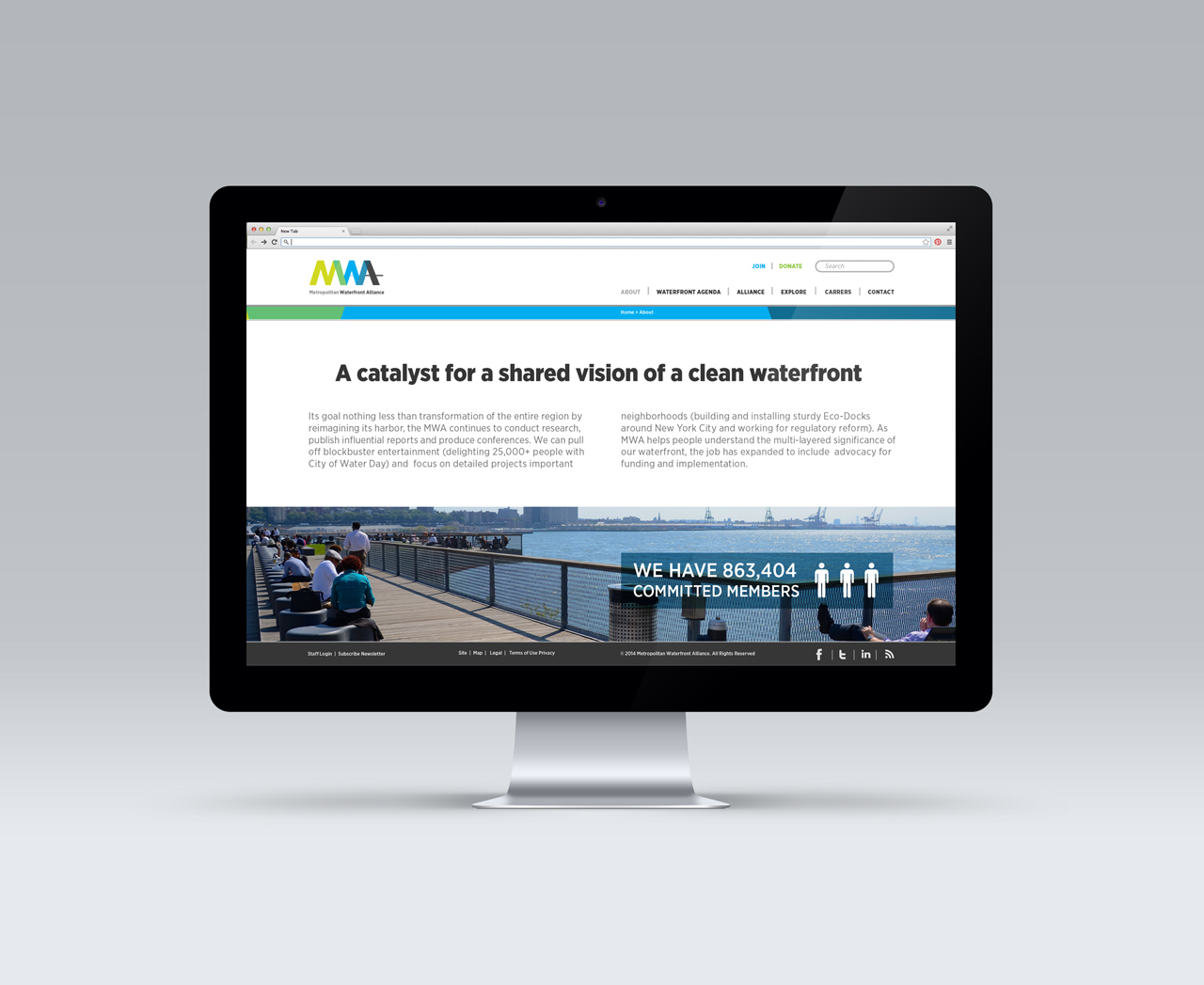
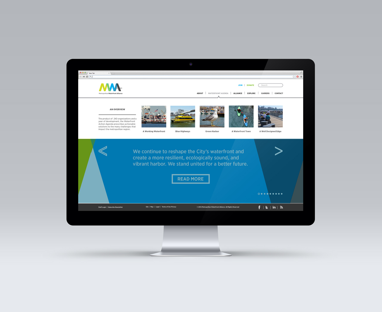
The Metropolitan Waterfront Alliance is a non for profit organization that works to transform the New York and New Jersey Harbor and Waterways to make them clean and accessible. Their purpose is to create a vibrant place for the community to use, learn, socialize and enjoy. However, the MWA is a relatively new organization, and not widely known to the general public.
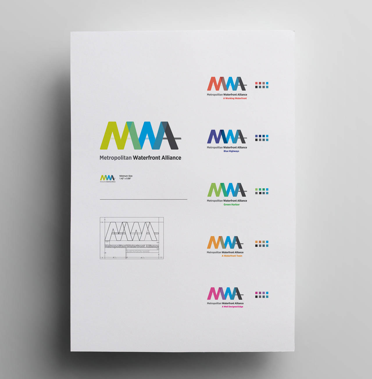
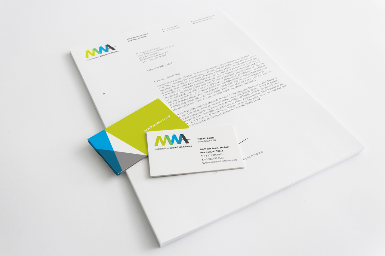
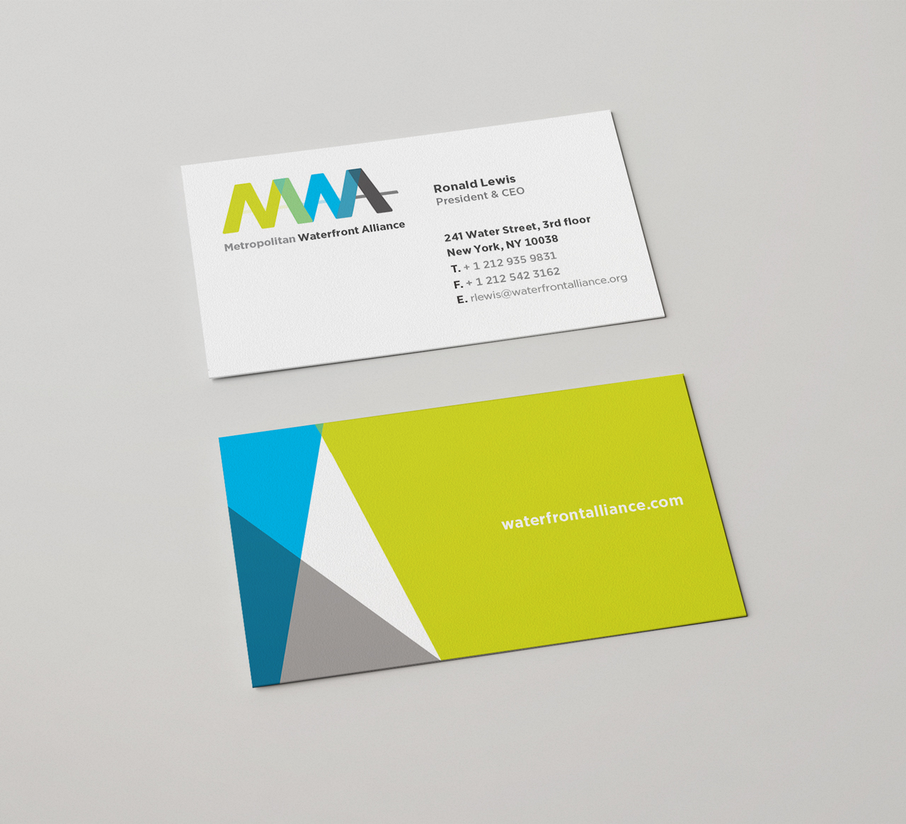
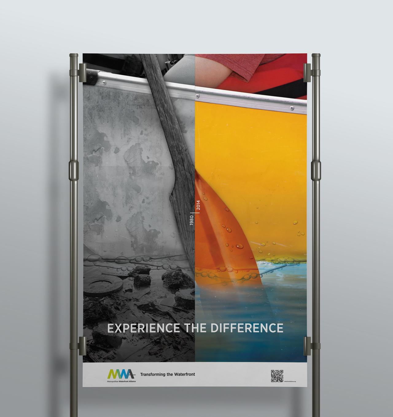
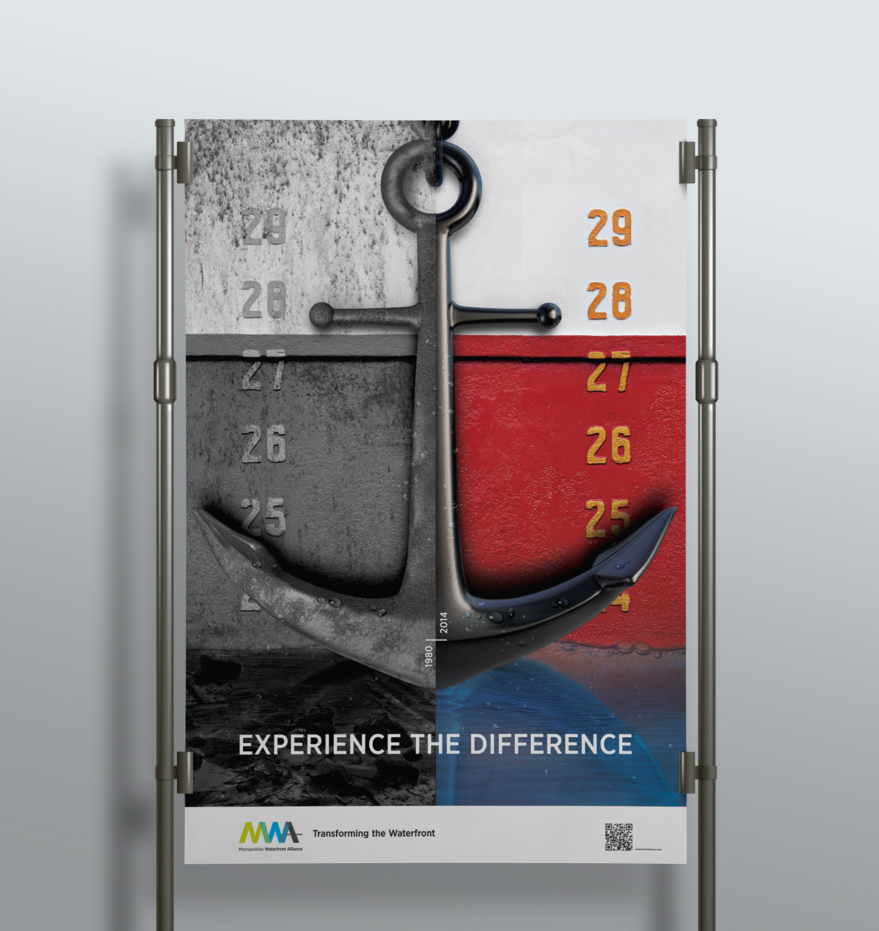
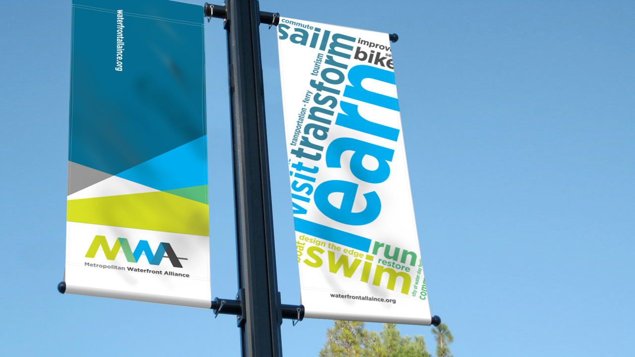
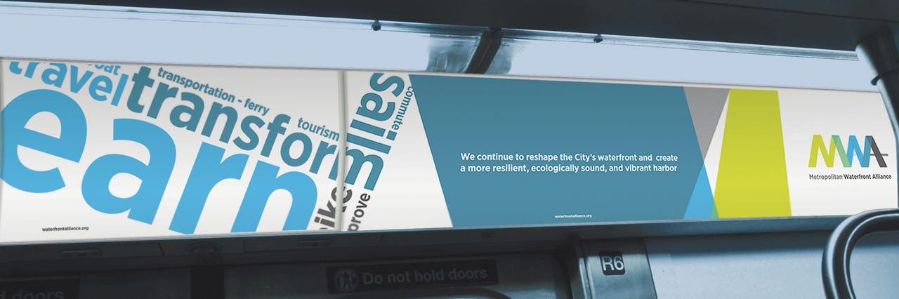
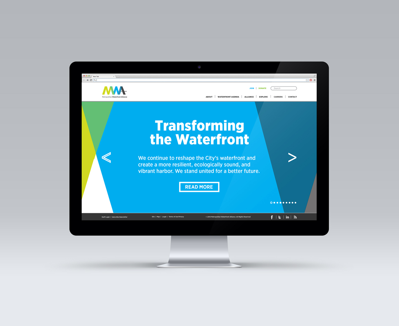
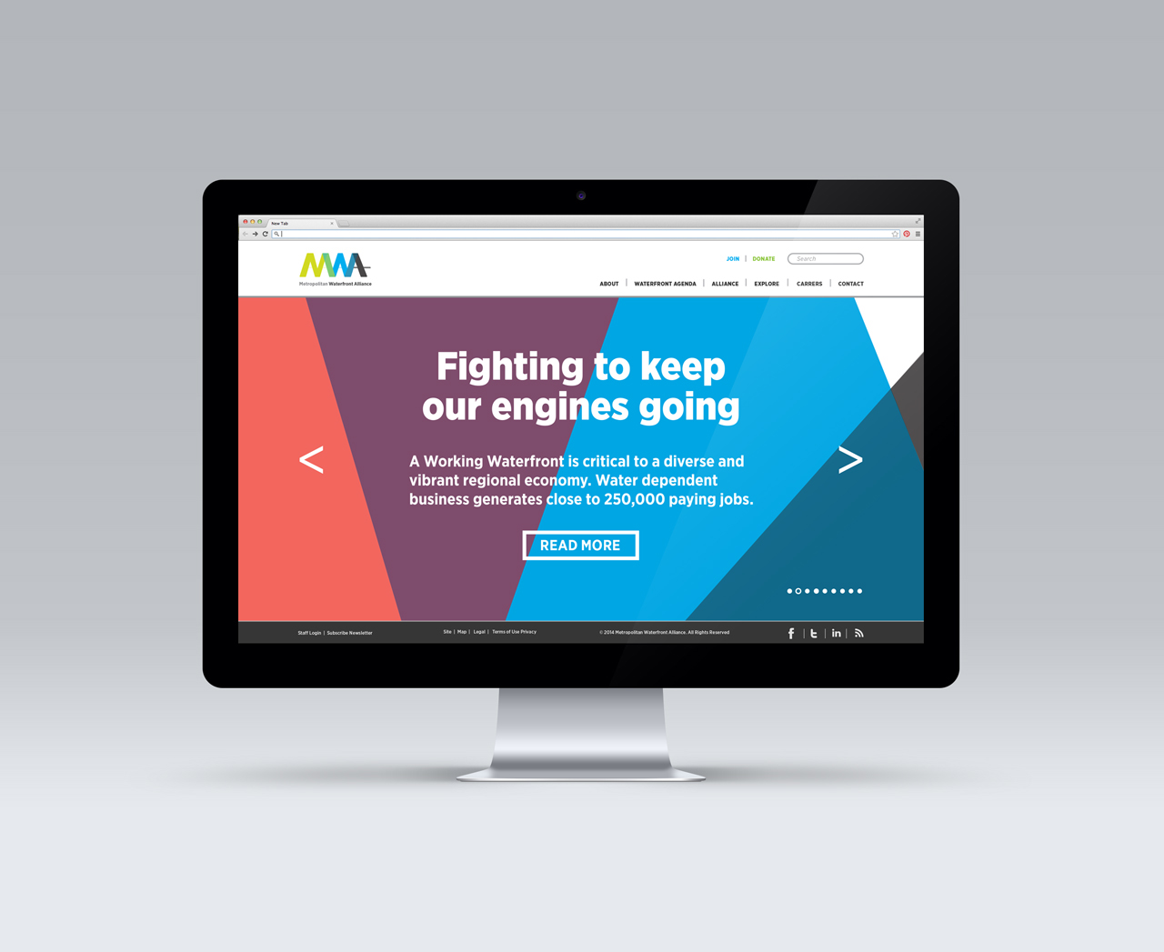
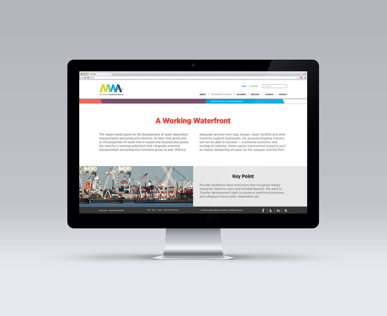
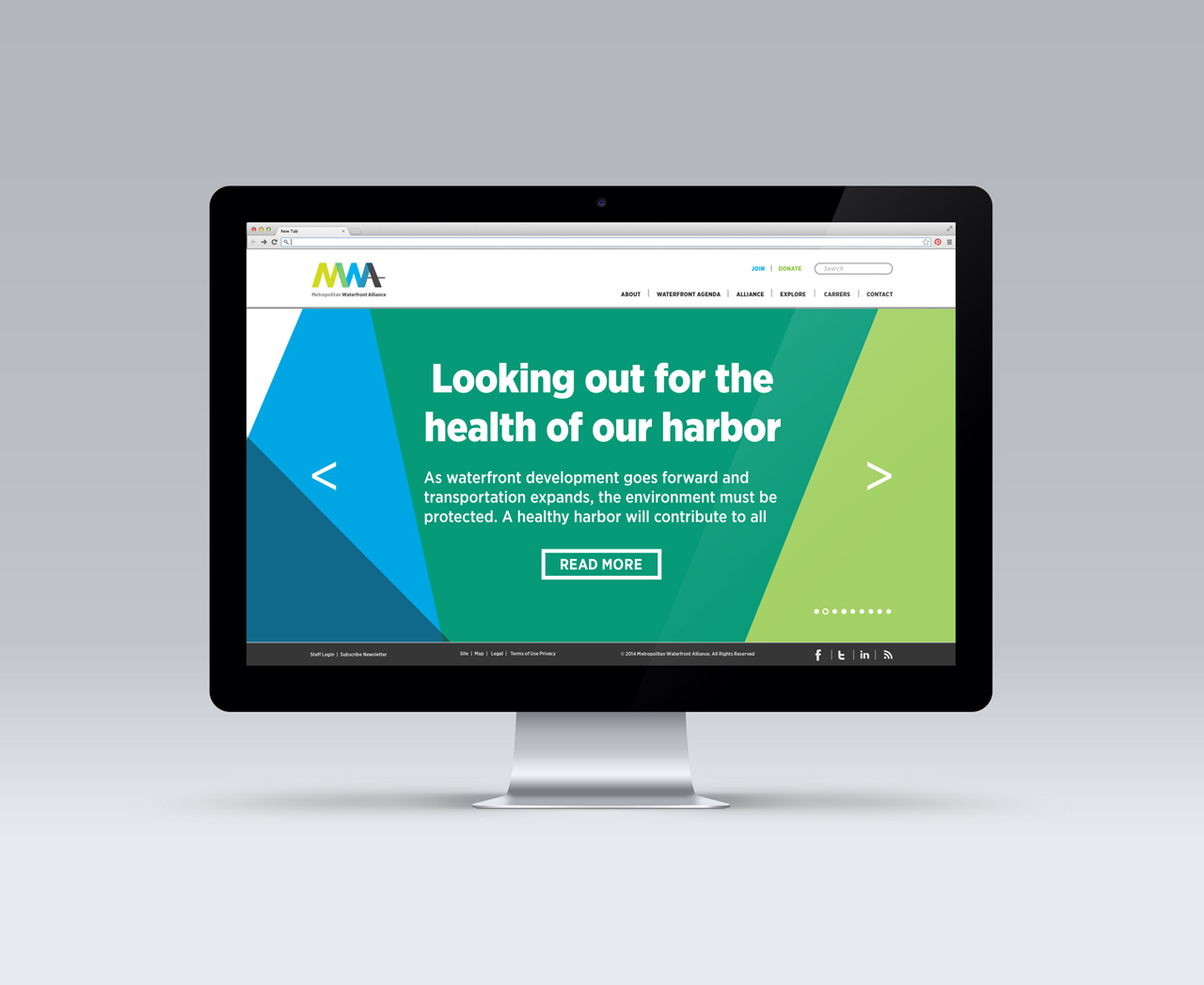
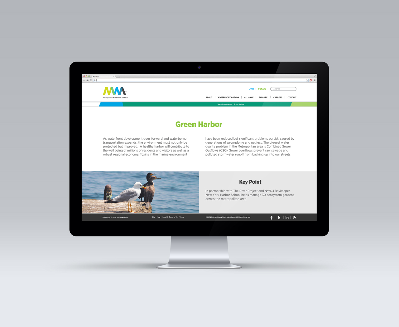
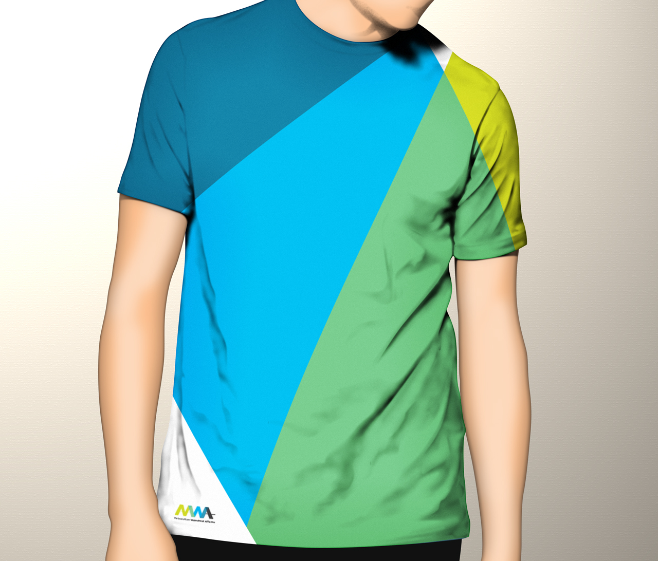
My design rationale was to create an identifier that communicated overall the strength of the union (alliance) between the stakeholders, within the organization, and the community. They are interconnected, and together they transform the waterfront, making it a vibrant and better place for everyone to use. Since one of the goals of working on a rebranding project is to raise awareness of a company's existence to an audience, I needed to create a bold and vibrant symbol so that it was memorable. For this reason, the design was inspired on the overlapping of elements that would build a strong, but fluid union. Together they all form the initials of the organization‘s name, MWA. The concepts that guided my design were: interconnection, transformation, vibrancy, and flow.
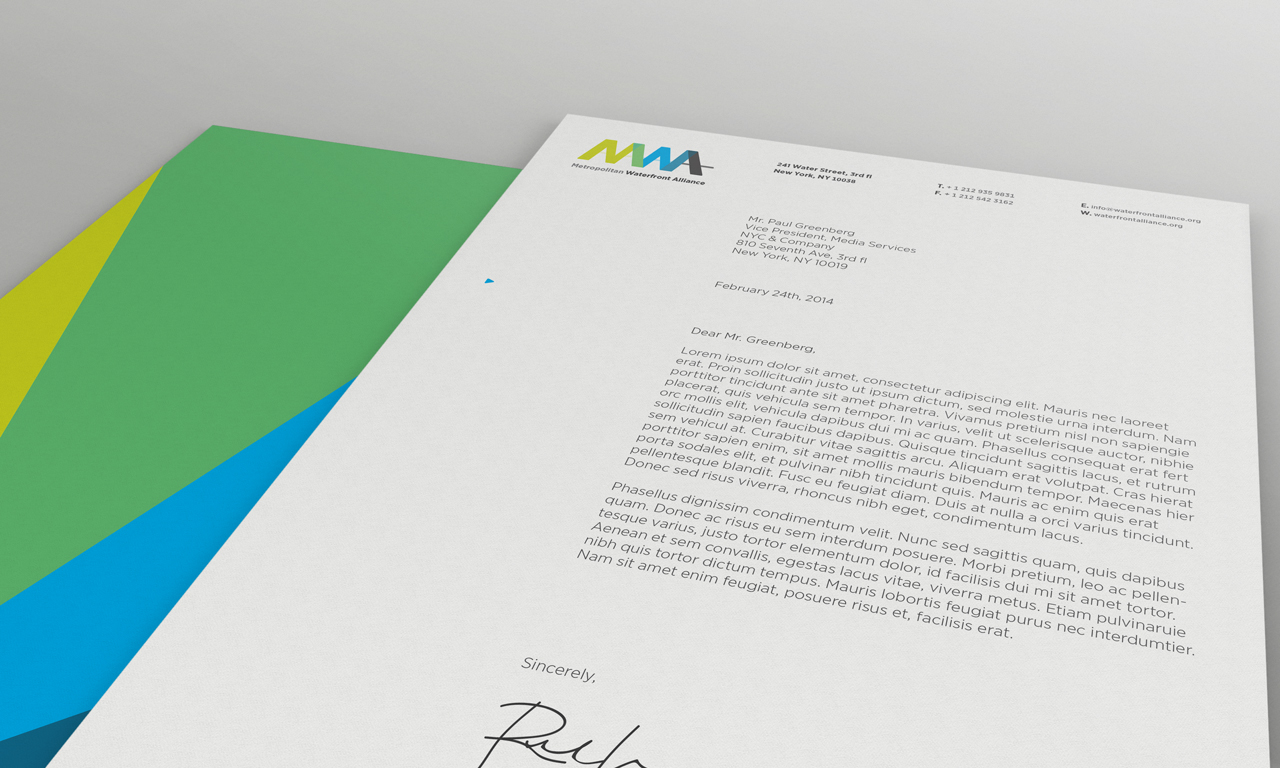
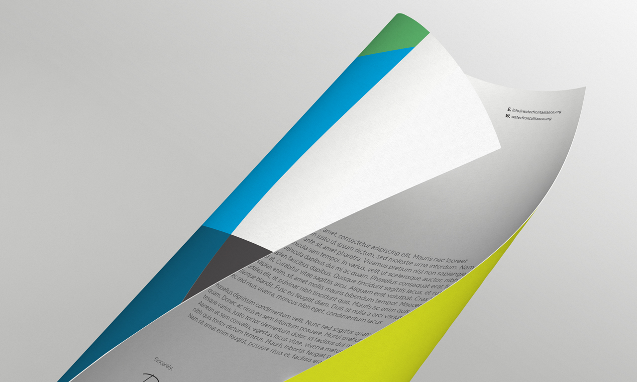
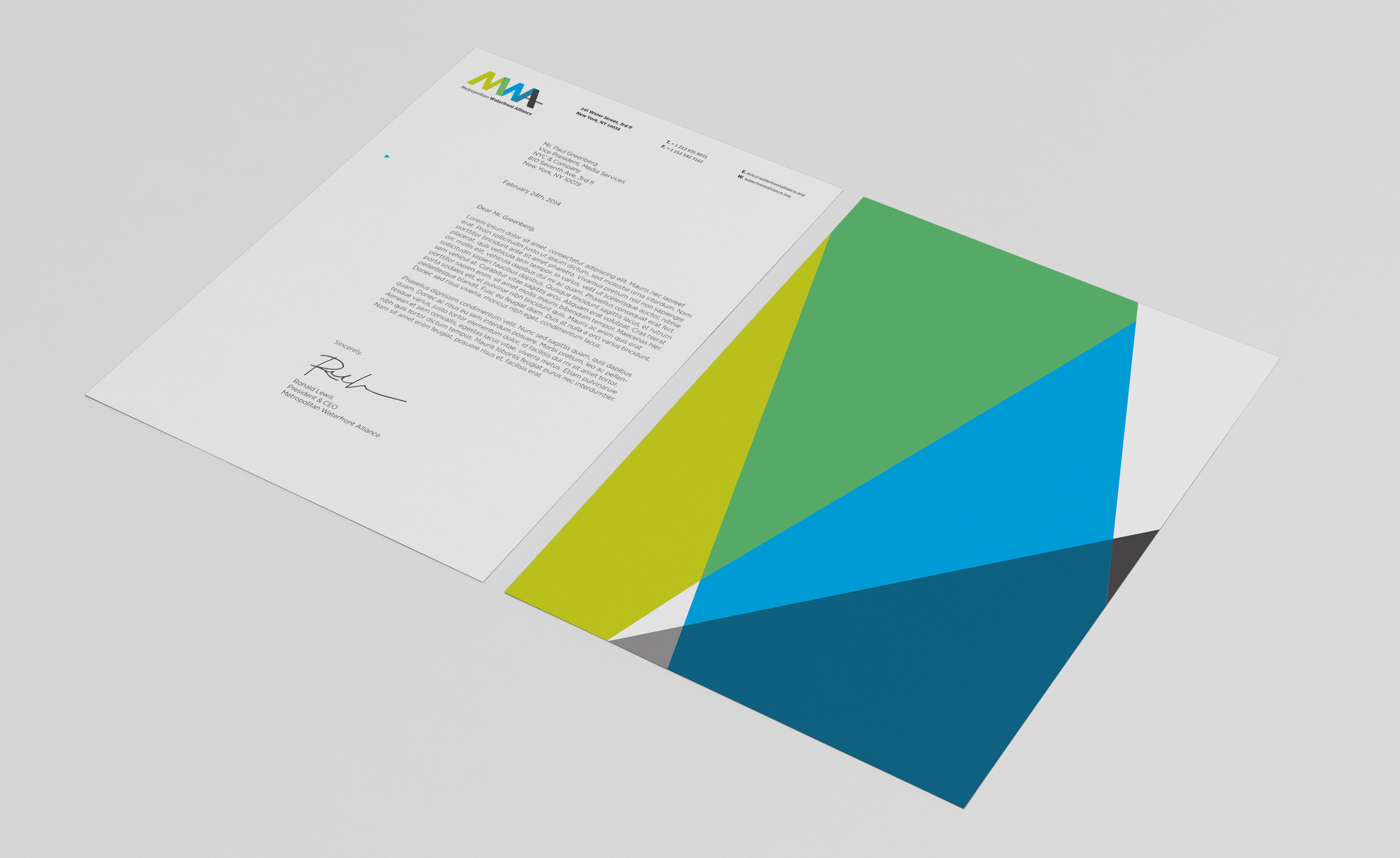
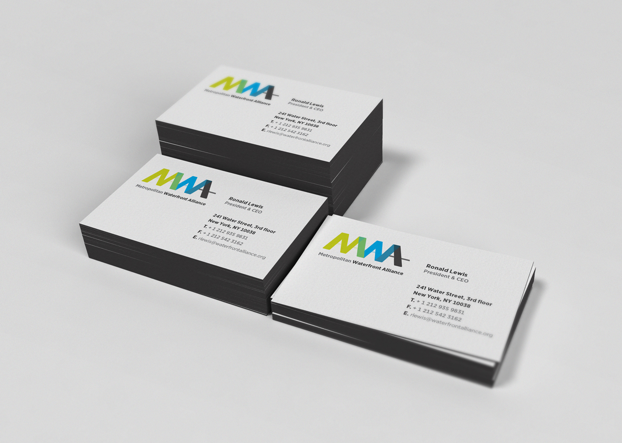
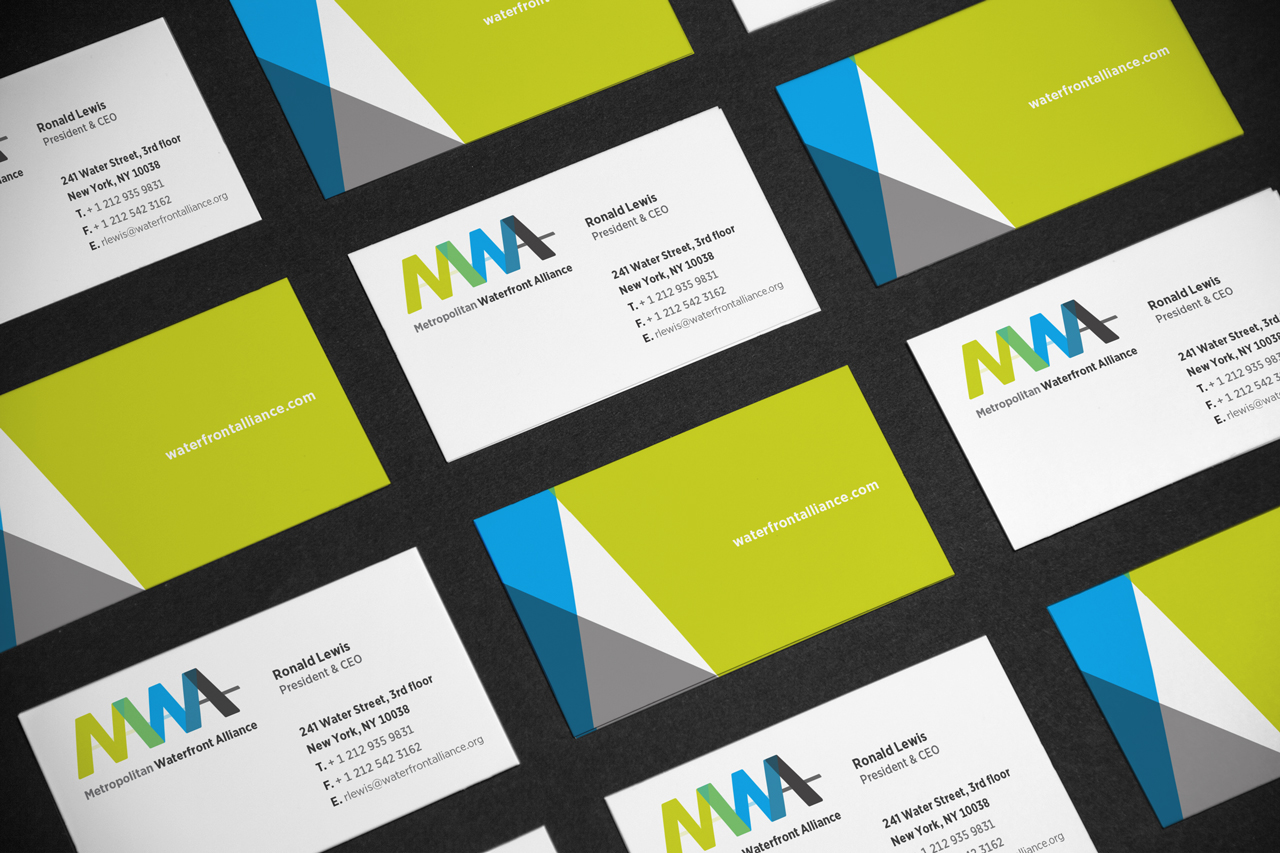
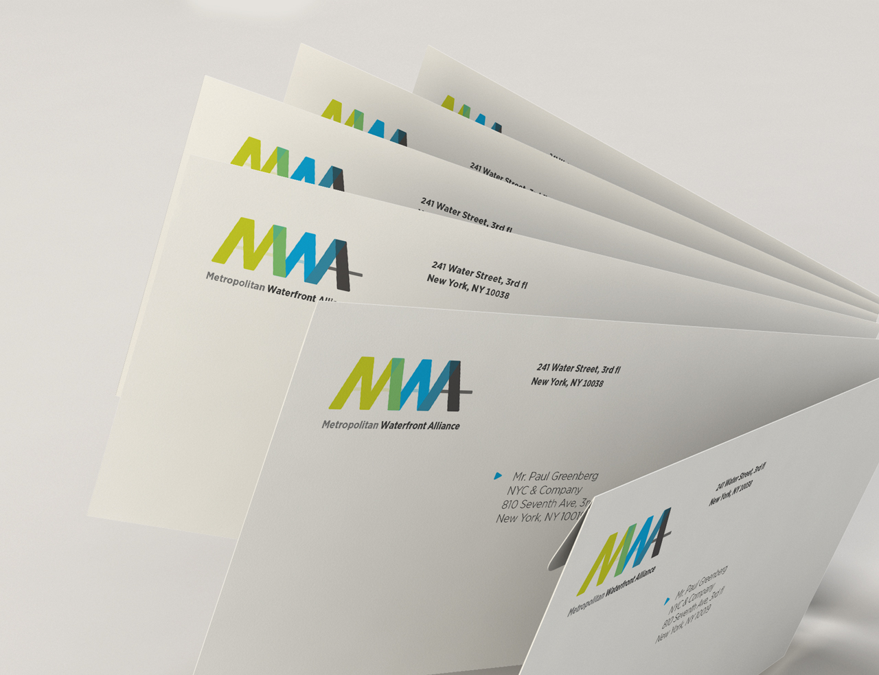
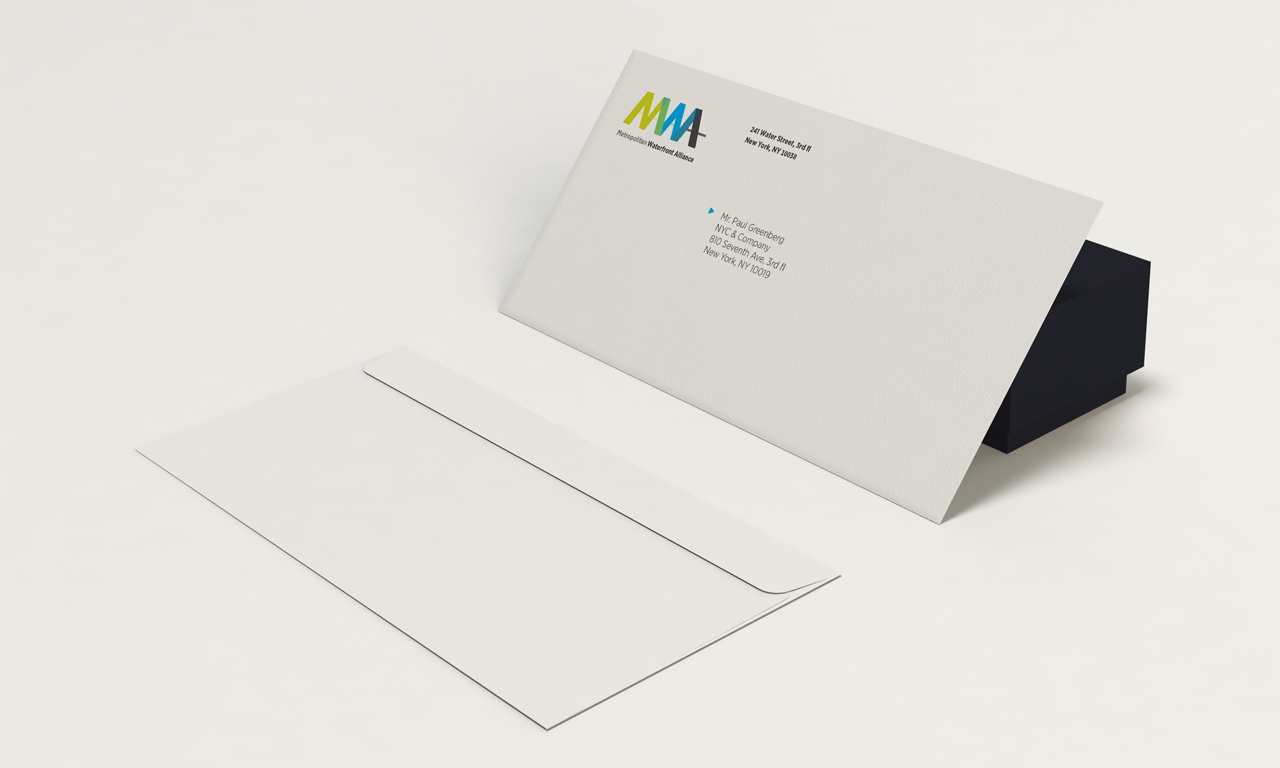
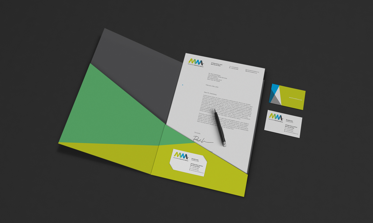
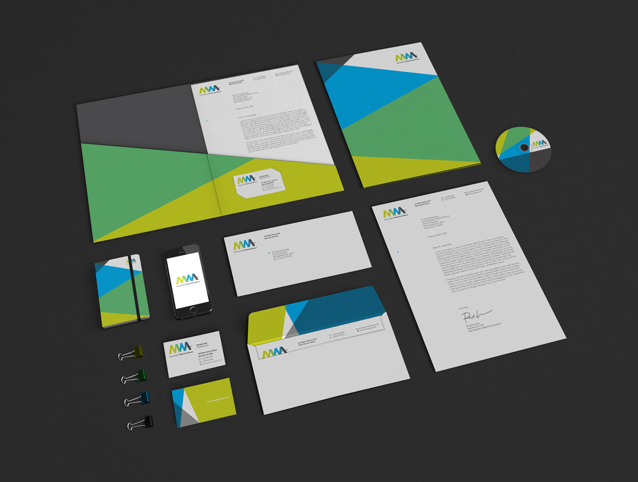
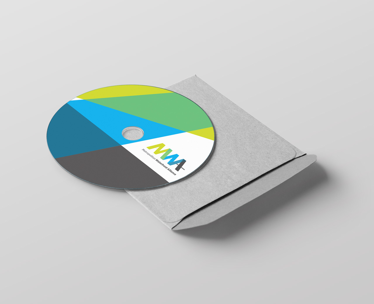
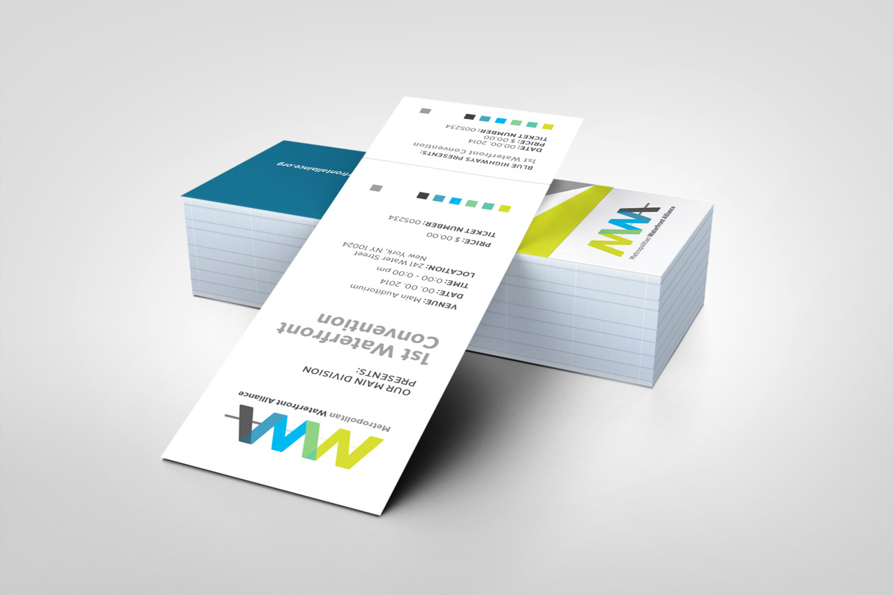
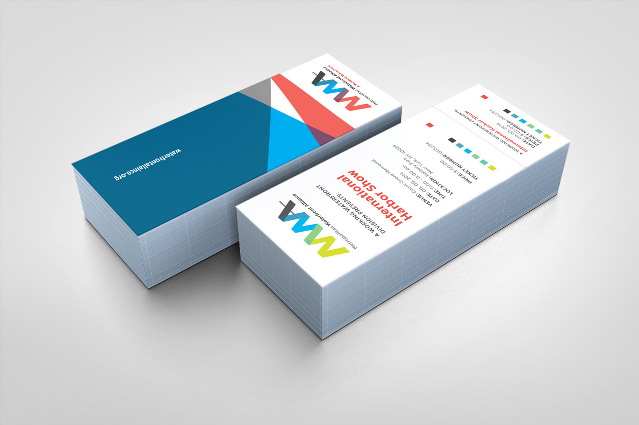
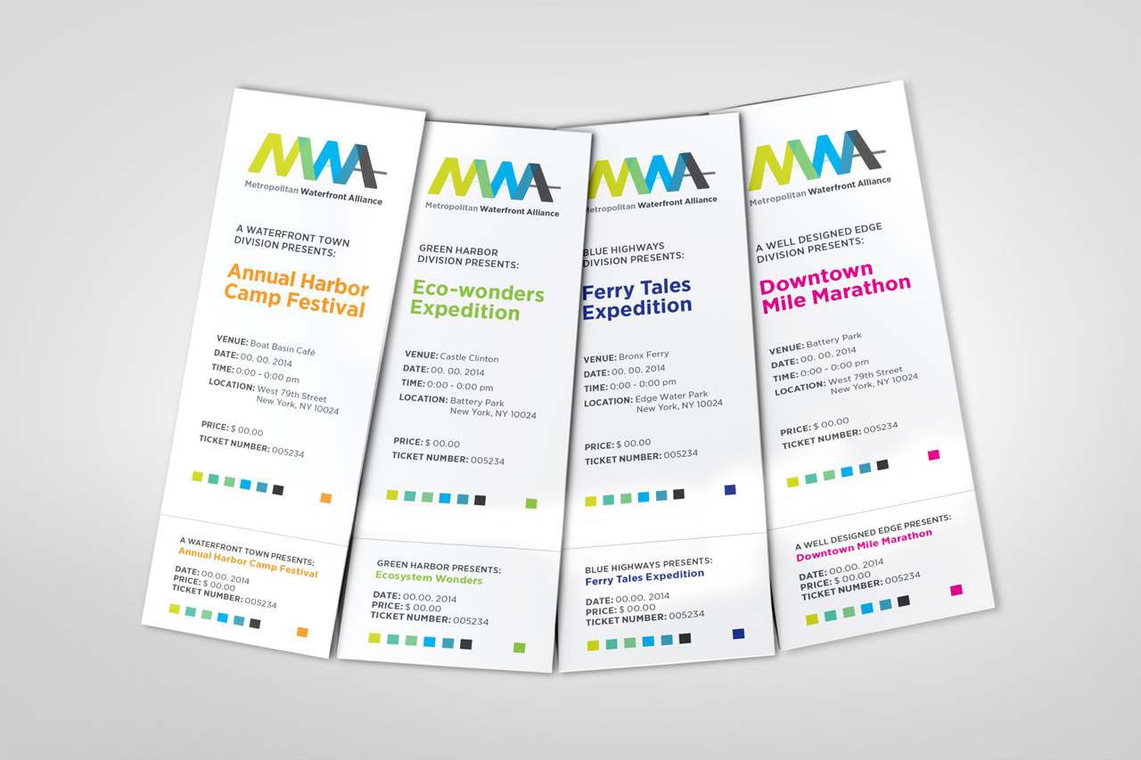
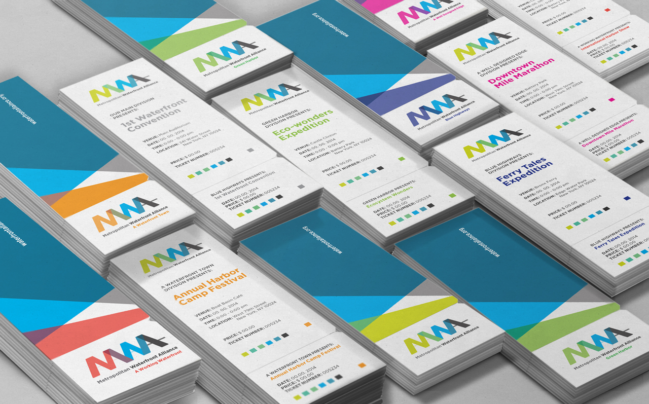
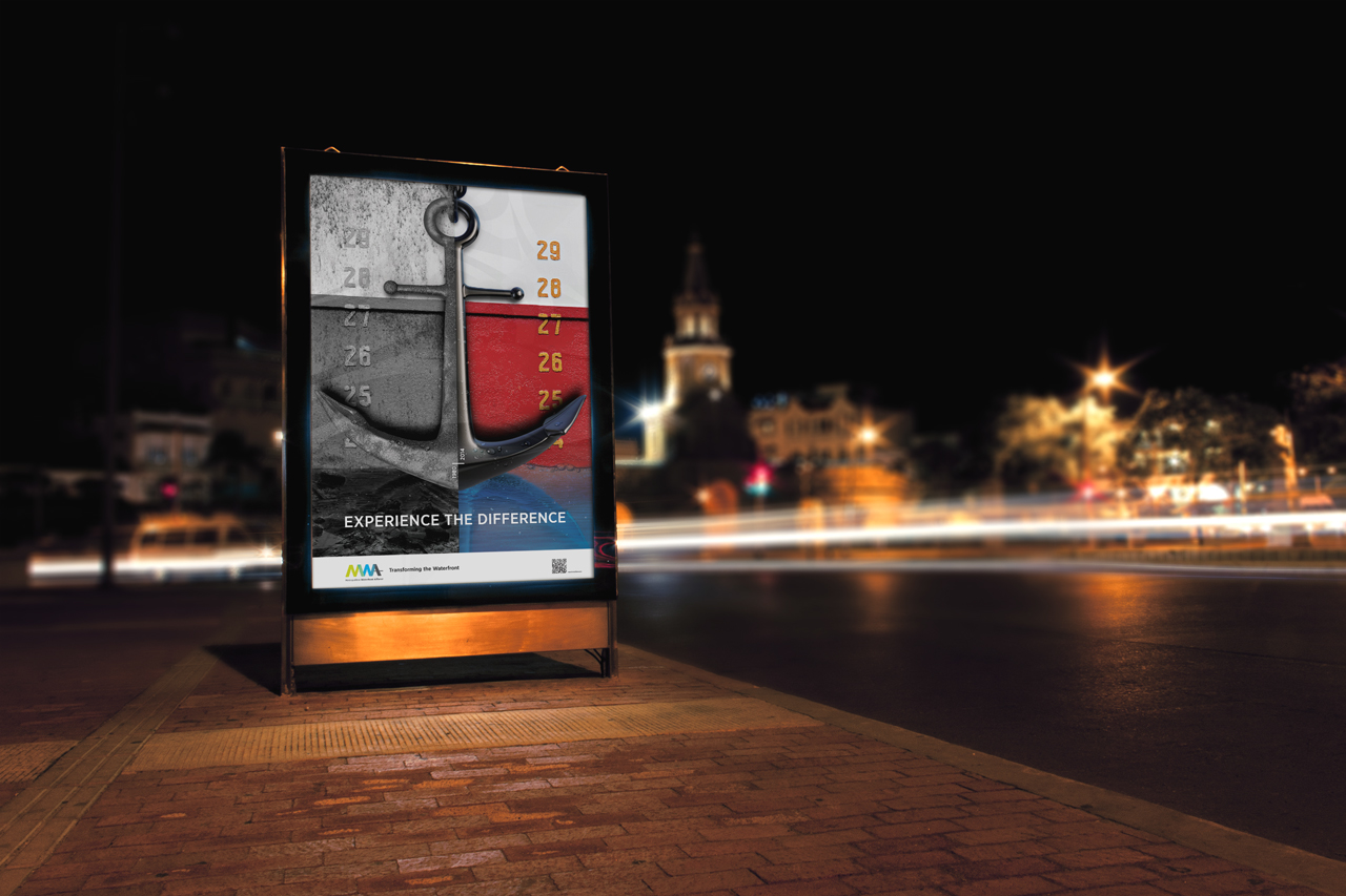
For this branding project I created multiple print/ digital applications: a sample of its stationery to see the application of the main logo, tickets for the application of the subdivision logos, light post banners, subway and bus stop posters, a website design with the new identity, and a t-shirt with the main logo application.


2015 Winner of the Annual Typography Competition
Communication Arts Magazine
Project: #237 MWA Rebranding, Under the Student Category
Communication Arts Magazine
Project: #237 MWA Rebranding, Under the Student Category